The Plan
Okay, using InstaCrawlR JSON Reader, I am now scraping instagram for the hashtag uselection. This was a bit of a random selection – it’s very topical at the moment.
I think that I am going to scrape the last 10000 posts using this hashtag.
I am then going to try to plot them against time.
While I am here, I am also going to scrape other related topics, such as
One of the challenges will be the size of the buckets (and how the buckets are created). So, the plot should have time along the x axis, and frequency along the y avis.
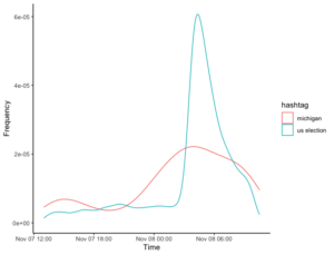
I am continuing to develop my skills (rudimentary as they are) in Data Science and Data Visualisation. The area that I am particularly interested in remains in the analysis of social media network, and especially Instagram. There is plenty of material here, but I’ve gradually been improving some of my processes and practices in this area, and one aspect that I thought might be worth looking at was the US election. With that in mind, I decided to put some of my skills to the test with some work on the US election. Specifically, I wanted to track the frequency of posts about different hashtags against time. I thought that, as the election count progressed, it might be possible to see if there was an increasing number of posts about the specific states that were involved in the counting at that time versus the US election as a whole. In particular, I was interested in those states that were swinging towards the democrats.
Step 1: Scraping Instagram
I decided to use InstaCrawlR to scrape Instagram for the following hashtags: #uselection, #georgia, #wisconsin, #michigan and #pennsylvania. Based on what I had seen on social media, the hashtag #uselection would remain high across the whole time period, but the others should increase or decrease over the period as interest in that particular state surged (as it looked like it was going to the democrats).
InstaCrawlR makes such things reasonably trivial, but there were two main considerations to take into account. Firstly, there are temporal issues with InstaCrawlR. I couldn’t select a specific timeframe to scrape – instead, I could only scrape the most recent posts – and the longer I left the program running, the more I would scrape, and the further back I would go. I was uncertain that I would get all of the posts, either, or just a selection (as is the case with twitter). I had made an arbitrary decision about which hashtags to include (after all, this is proof of concept more than any kind of research), and now I made an arbitrary decision to collect ~ 10000 posts on each hashtag. Ideally, I would have liked to have started all these searches at the same time, but that wasn’t possible. Still, they were all conducting within the same 20 minute period or so.The download was stored as a csv file that I could then use readCSV to import into RStudio.
Step 2: Wrangling the Data
The next challenge was to plot this against a time series. This actually proved to be harder than I anticipated, and was a good learning experienced for me. Of course, the posts are actually continuous data – they occur every few seconds over the period of time that I scraped. This means that the ‘frequency’ of any one tweet at any one time is one (unless there were two at the exact same time – which is unlikely). So this meant that a scatter plot wasn’t really going to give me the kinds of solutions that I was interested in.
The way this is usually managed is through a histogram is to create ‘bins’ or ‘breaks’ – series of data. For example, in its case, I could make one for each hour, or perhaps even minute. However, I again ran into some difficulties here: while I could create a histogram, what I actually found was a really skewed plot – the range across the x axis was much to big, going back to April 2020. I actually tried a few different ways to fix this, but I was mucking around with time and data and POSIX objects and I couldn’t make it work.
I also learnt about the trunc function for the dates and times – trying to create the right bins.
After pausing and reconsidering, I came up with another idea. In fact, a bit of judicious searching on Stack Overflow gave me the answer. What I need to do is create a density plot. The density plot will take care of the bins for me, and is actually the kind of plot I originally envisioned.
I also made sure I selected a subset of the total posts I collected – so it was approximately 24 hours.So far, so good.
Step 3: Multiple plots
However, this is where it went a bit wrong. Density plots require one data frame.
Step 4: Wrangling the data
Step 5: Making it interactive
Never made it this far. For some reason, InstaCrawlR is not working – it appears to be an issue specifically with the hashtag.
This is where I got: