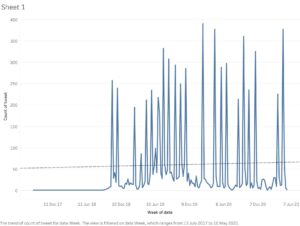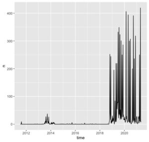
I was asked to do a very simple time series chart showing how #edureading contributions have changed over time. It was easy to do, both in R Studio and Tableau. Quite a difference in appearance, although I did only use the very basic tools in R Studio.
### EduReading Time Series Data

library(rtweet)

ts_plot(edureading_may21, "days")

ts_plot(edureading_may21, "weeks")

ts_plot(edureading_may21, "years")